Web App
Diplomat Pharmacy
Patient Portal
Overview
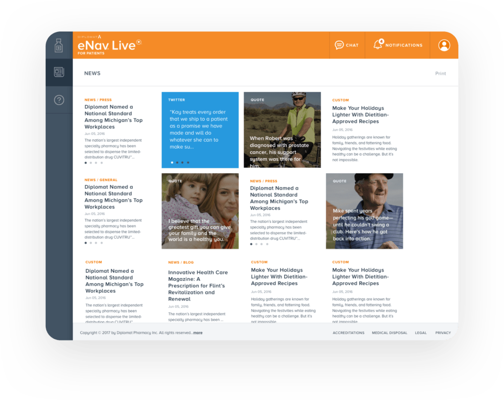
Digital transformation of orders management processes for US’s largest independent specialty pharmacy.
Responsibilities
Research, facilitate workshops, sketch,
wireframe, prototype and design.
Year • Location
2016 – 2017 • Flint, MI
👋 About
Diplomat Pharmacy (now part of UnitedHealth Group) is the US’s largest independent specialty pharmacy. They specialize in selling high-cost, high complexity drugs, which are used to treat rare chronical diseases like Hepatitis C, Hemophilia, HIV and others…
🤔 The Problem
Most of Diplomat’s patients have reoccurring needs for prescriptions and medications, all of which are requested through paper forms or the pharmacy’s call centers. This slow process brings multiple complications for the patients and the pharmacy.
🦸♂️🦸♀️ The Team
A team of two BAs, one PM, Lead Developer, seven software engineers and me leading the design efforts.
Process
Following the Design Thinking approach we came up with a plan divided into three stages:
Learn
Interpret
Solve
Learn
Understand the product, clarify initial assumptions, uncover user pain-points and insights.
🎙 Stakeholder Interviews
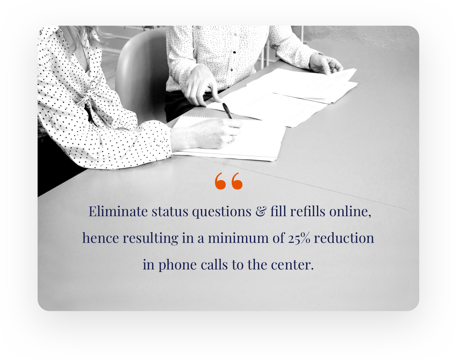
SHI helped us understand the stakeholder’s vision for the success of the project and their perspective on what the patients’ needs are. Our main project goal is outlined in the slider.
🕵️♂️ Competitors Audit
We analyzed competitors based on their strengths/weaknesses helped us identify what the market offers. Turns out a lot of their competitors already had a web app for ordering medications.


👥 Qualitative User Research
Through user interviews and customer care center observations, we learned that our main users were Patients and Caregivers. Most of them were afraid that their packages would be rescheduled or lost. So they were checking what the actual status is by calling the centers.
📄 Quantitative User Research
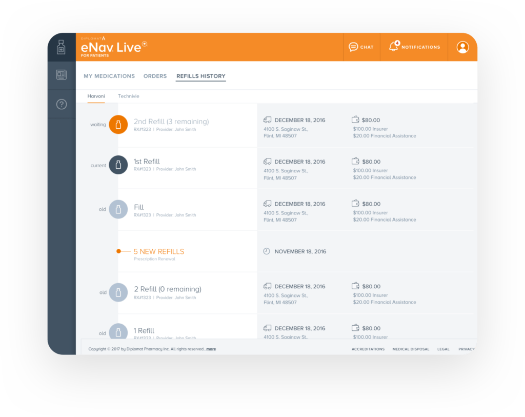
Using surveys and analyzing google analytics data helped us uncovered more insights. One of them was that it’s crucial for patients to understand their co-pay early on. Also, they needed a clear overview of how much they’ve paid historically, as prices may change with different prescriptions.
Interpret
Synthesize the research with empathy for the user, understand the problem and talk about potential solutions.
🖍 Design Thinking Workshop
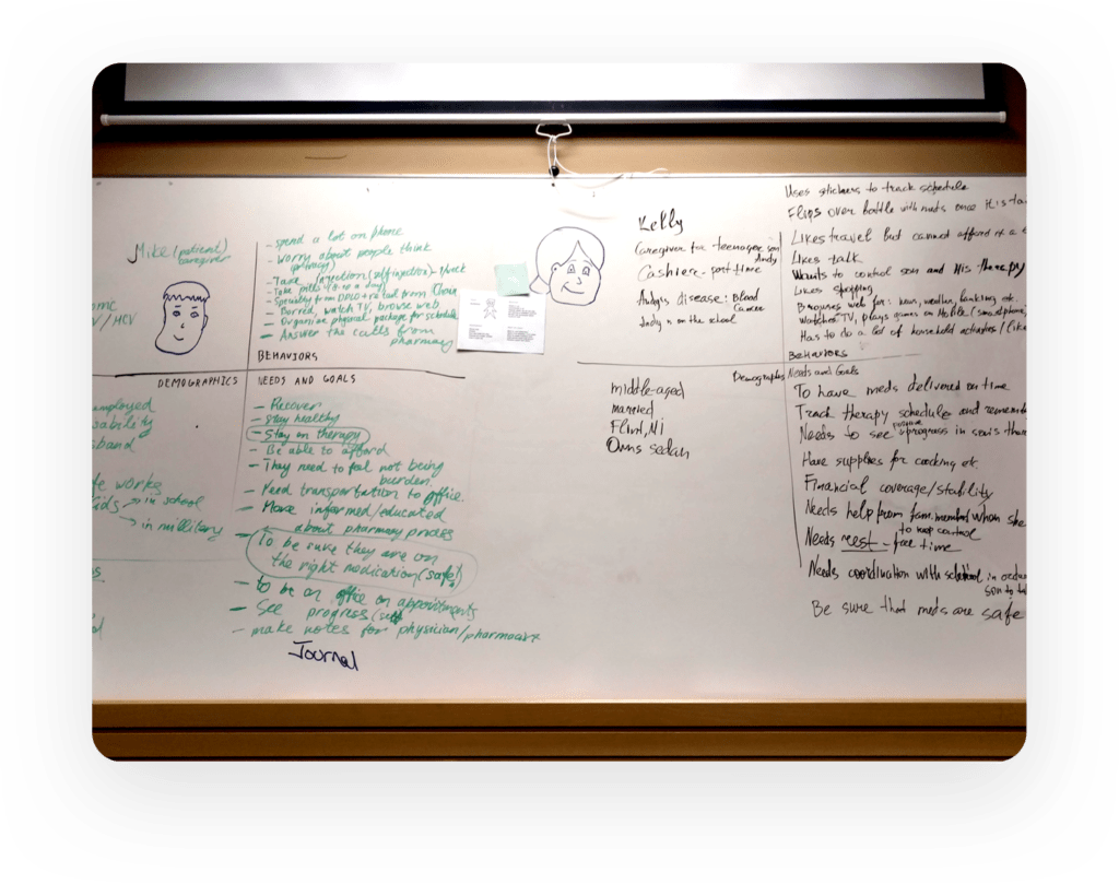
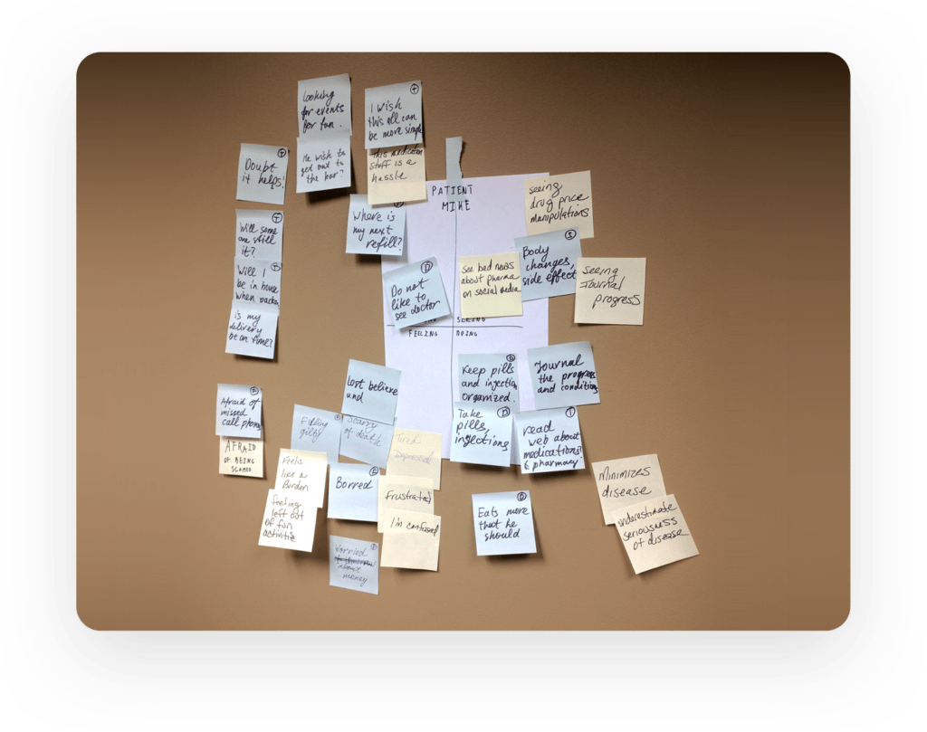
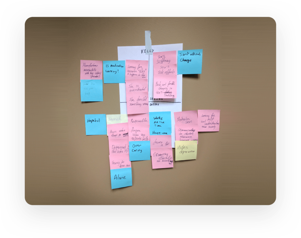
After collecting the information on users, we got together with the stakeholders and conducted a Design Thinking workshop to interpret and summarize the data we have accumulated so far into personas, empathy maps, frame the problem and brainstorm on potential solutions.
🖍 Design Thinking Workshop
After collecting the information on users, we got together with the stakeholders and conducted a Design Thinking workshop to interpret and summarize the data we have accumulated so far into personas, empathy maps, frame the problem and brainstorm on potential solutions.
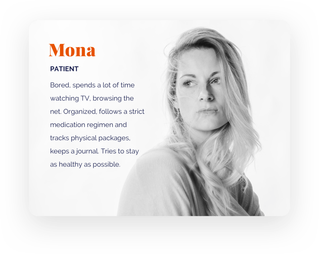
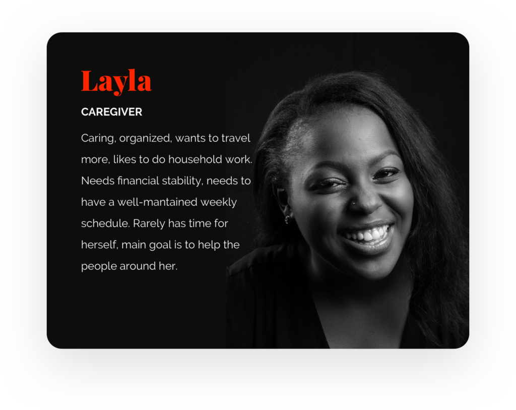
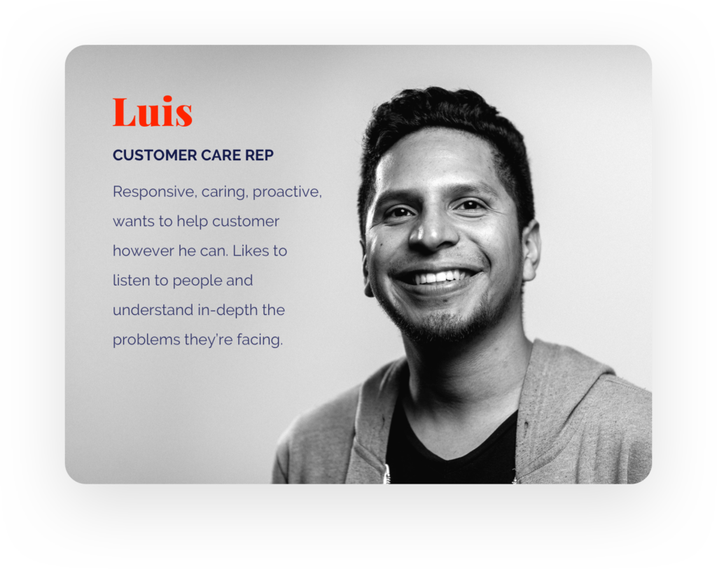
👤 Personas
This method helped us forge an alignment on user behaviors, needs and goals in a concise way, based on our initial research.
📌 Problem Statement
Formulating a problem statement, so we know what we’re solving for.
“Patients need a fast, portable and independent way of checking and managing their orders so that they can get their life-saving medication on time within their budget constraints.”
⛳️ Goals
Defining the main goals of the project
I. Status Overview
The patients/caregivers needed a clear and simplified overview of order statuses and co-pays.
II. Easier Order Management
We want to give the patients an option to order new medications and provide reminders for a new refill.
III. Education, Help and Support
We want the patients to feel comforted every step of the process and we intend to do so by hand-holding them throughout their portal journey.
Solve
Visualize the solutions in a way that they can be validated as well as refined early and often.
🗺 Information Architecture & Flows
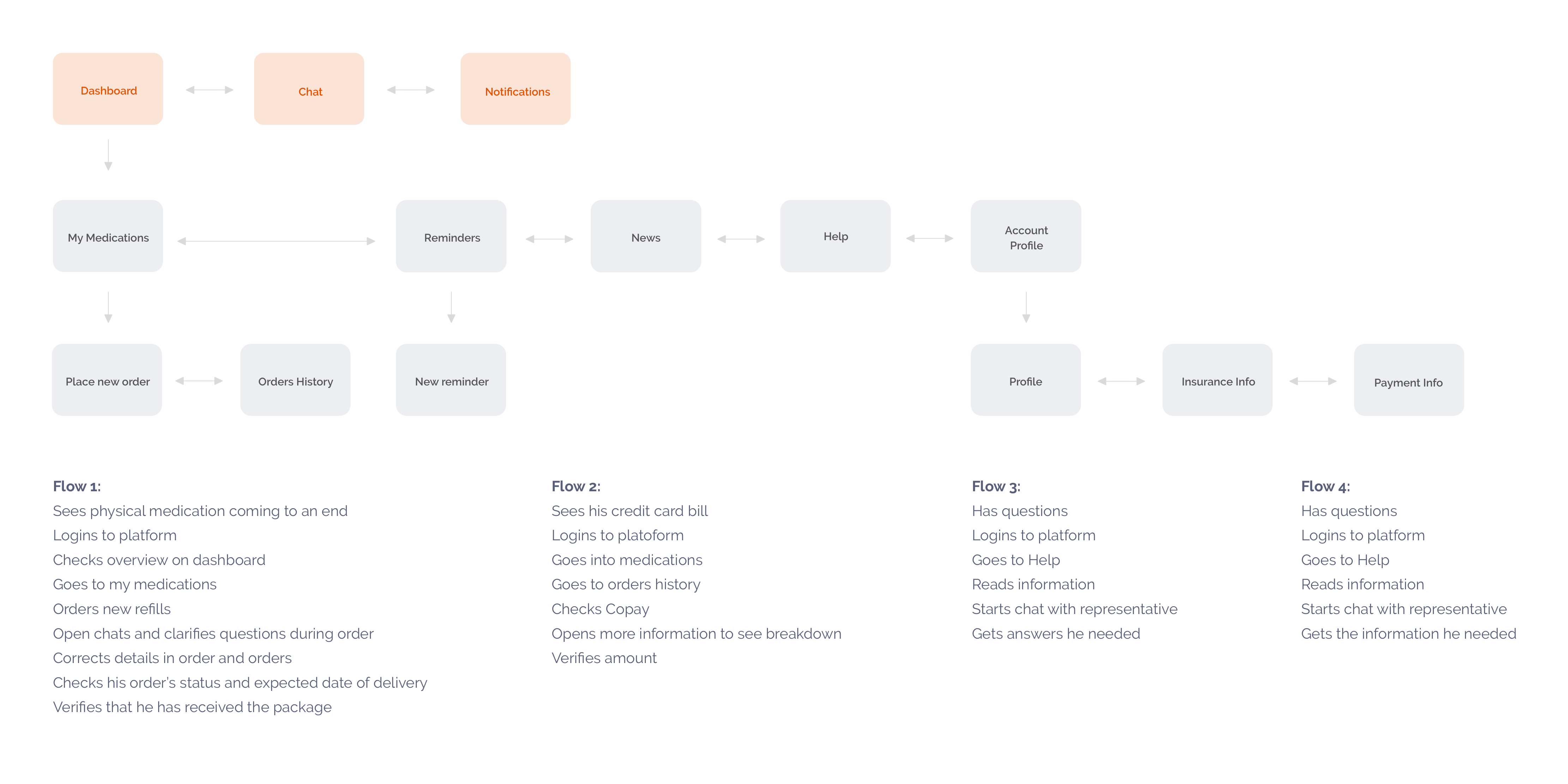
Sitemap and a few example user flows for the app helped us break down the different steps by features.
✏ Wireframe
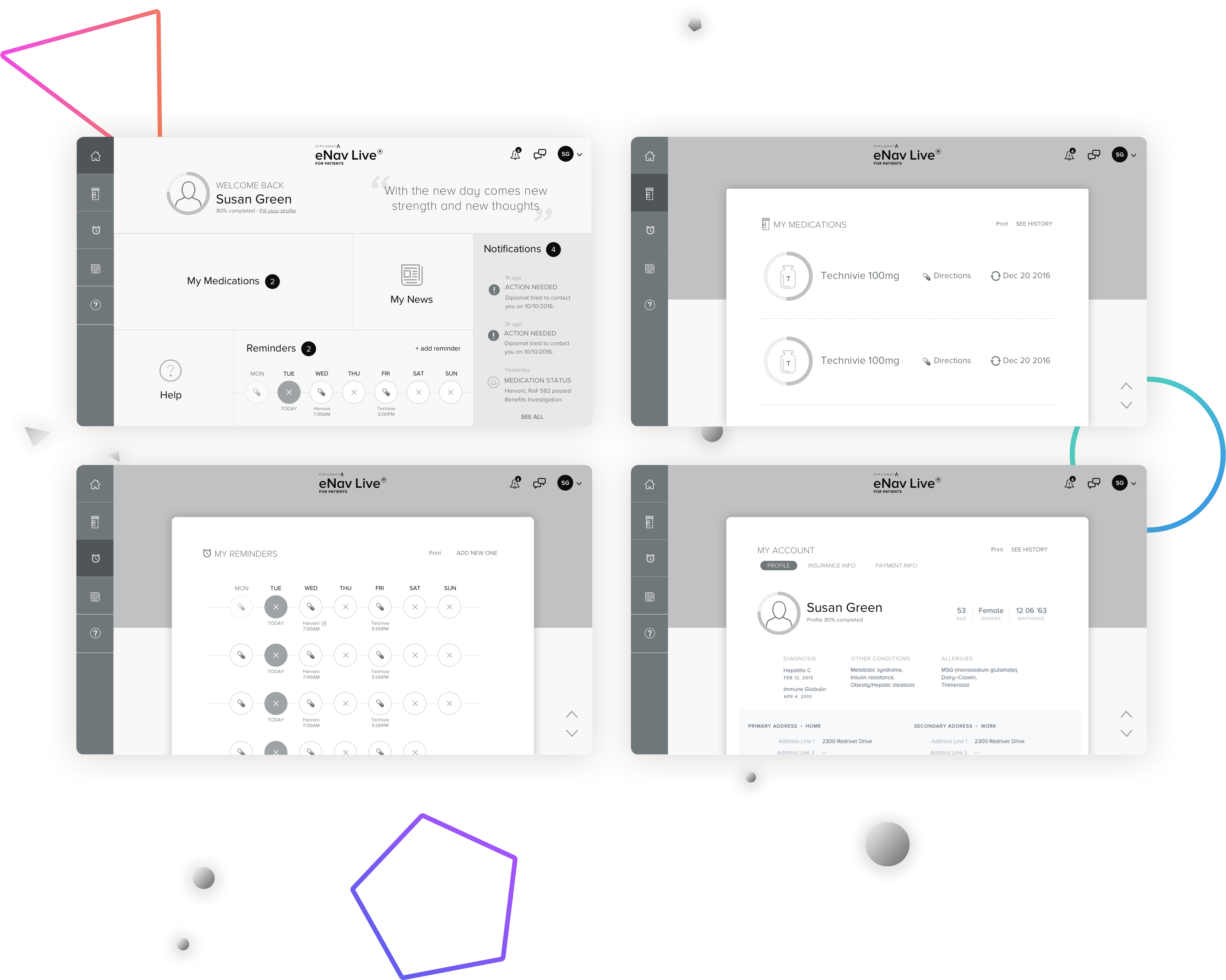
Building the initial app structure through wireframing.
🖌 Prototype & Design
Bringing the solutions to life while validating them with the dev team.
Moodboard
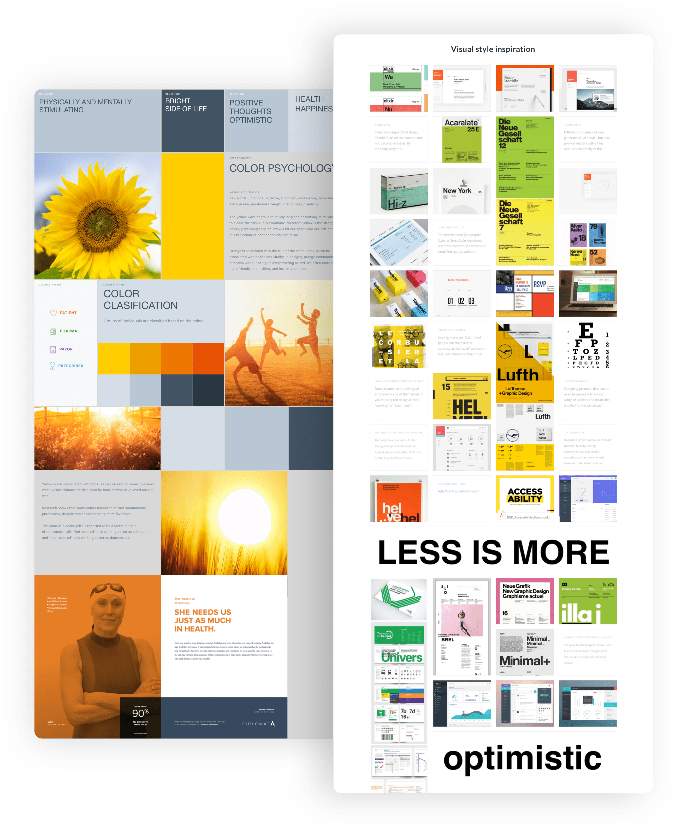
Taking into account our visual research grid, we created a mood board to communicate our vision for the app. We wanted clear, big and bold typography with emphasize on the yellow gamut. We intentionally choose these colors, because they spark positive feelings and the large letters and iconography would be convenient for users with visual impairment.
Moodboard
Taking into account our visual research grid, we created a mood board to communicate our vision for the app. We wanted clear, big and bold typography with emphasize on the yellow gamut. We intentionally choose these colors, because they spark positive feelings and the bulky letters and iconography would be convenient for users with visual impairment.


I. Status Overview
Dashboard
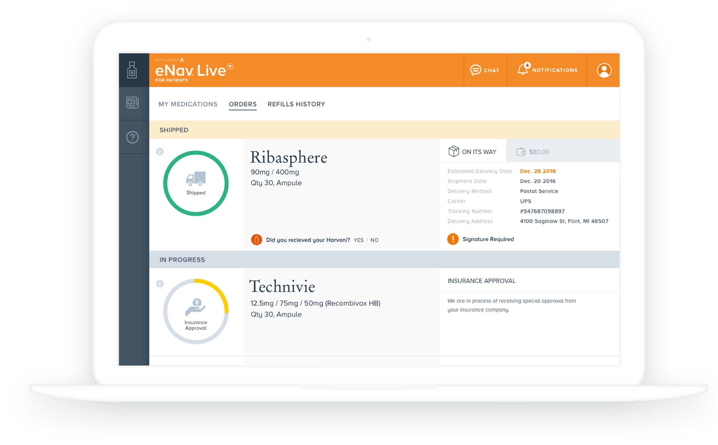
Our approach was to create a dashboard, broken down into 2 segments: on-hand medication and pending medication. In the pending tab (or orders) patients can review their current shipped medication status and see the ones which are in the approval process.

I. Status Overview
Dashboard
Our approach was to create a dashboard, broken down into 2 segments: on-hand medication and pending medication. In the pending tab (or orders) patients can review their current shipped medication status and see the ones which are in the approval process.
II. Easier Order Management
Place Orders + Reminders
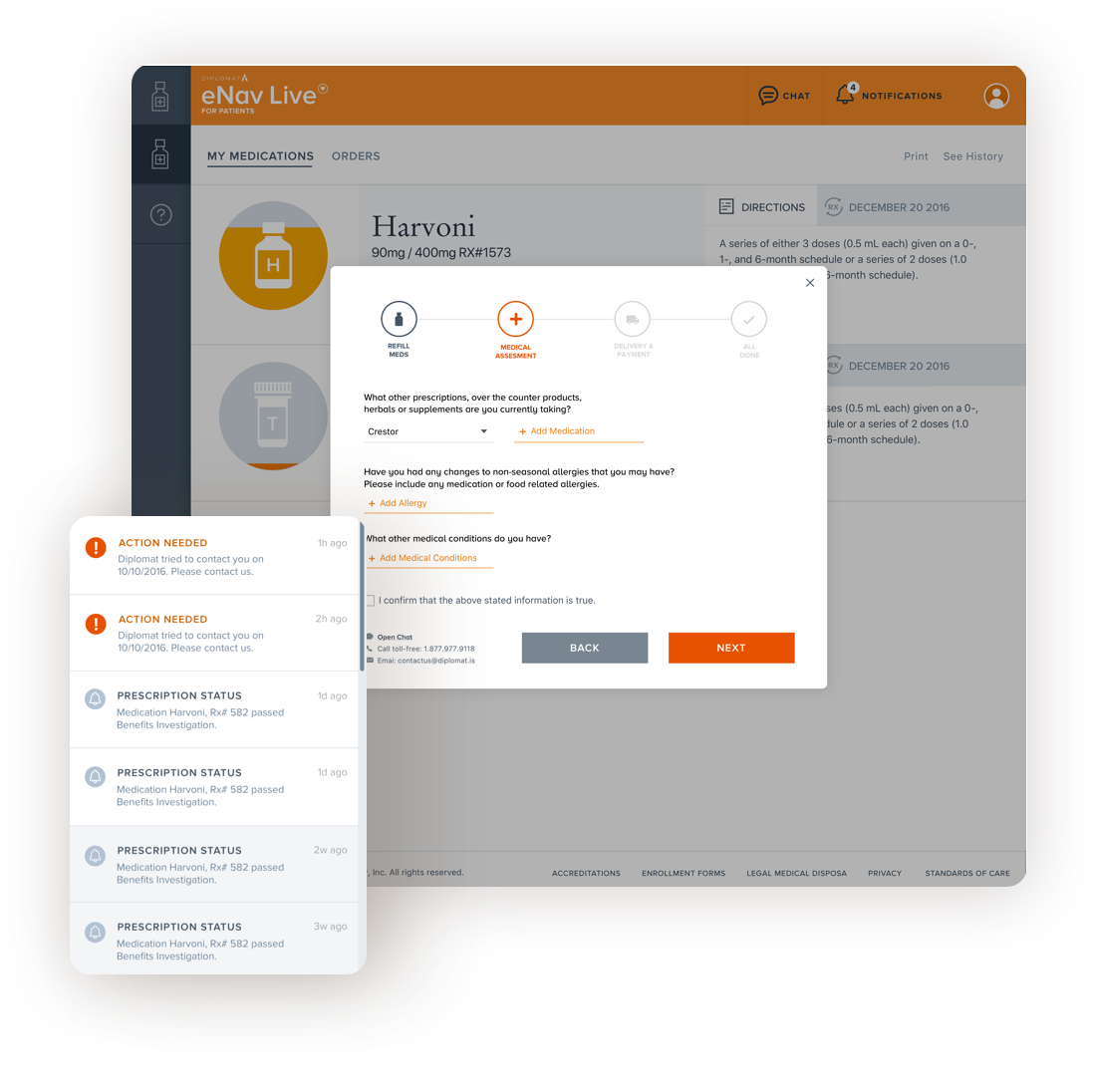
We build a wizard, which walks the user through the process of placing a new order. We added an option to receive reminders when it’s time to put a new shipment, both on the platform and on their phones.
II. Easier Order Management
Place Orders + Reminders
We build a wizard, which walks the user through the process of placing a new order. We added an option to receive reminders when it’s time to put a new shipment, both on the platform and on their phones.


III. Education, Help and Support
Chat, FAQs, Onboarding
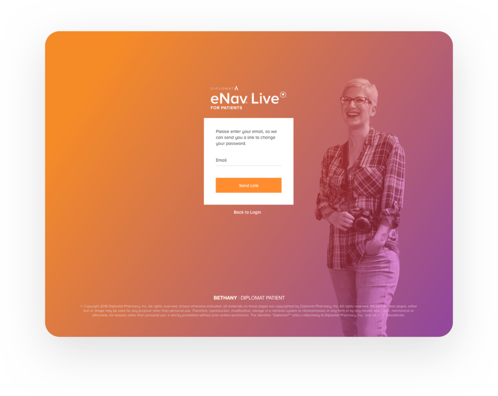
We created an onboarding experience with step by step guide. Directions and dosage information were added for on-hand medications. Further or immediate support could be sparked with a simple click to chat with a customer center representative. For people in need outside of working hours, we created an FAQ page and alternative contact details.
Other screens
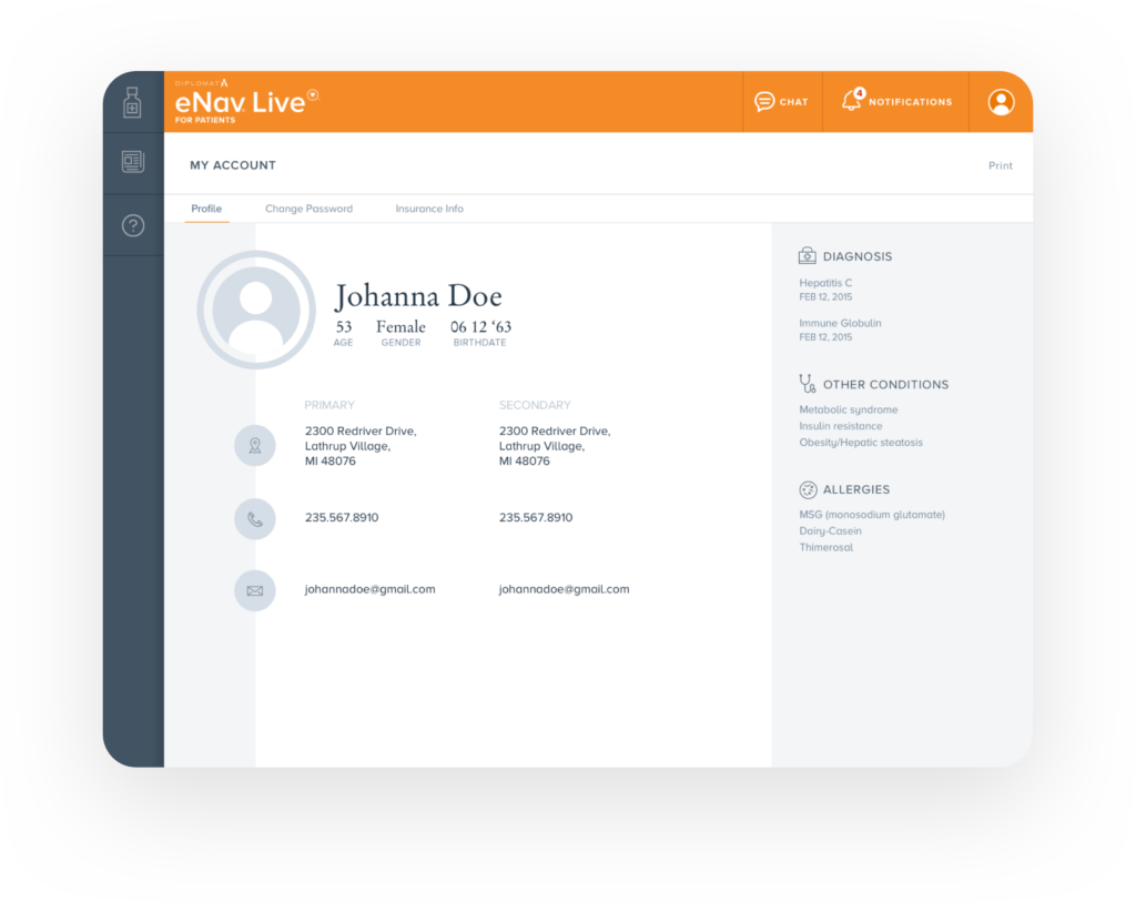
Other screens
👥 User Testing
We wrapped up the process by testing the design with real users ( through Invision ). Reaching out to a few of the users from the interviews helped us speed the recruiting process. After we guided the customer through the screens, we updated the designs based on their feedback.
✌️ Conclusion
As in any other product research was key and we were extremely lucky to have the full support of our client in gathering users. We build a great portal that caters to the user’s needs and by testing our hypothesis early and often we managed to get confidence in our decisions. The results were an increase in patient satisfaction and a massive drop in calls to the client’s customer care center.
🎖 Testimonial
“Miro is one of the guys who makes SoftServe great. He is young, bright, smart, and creative. Has done a great job working with Diplomat to help make their products better.“

Anthony Mazzuca
Business Development
