
In-store web + mobile app (tablet)
Currys Deals App
Overview
Enriching the capabilities of a digital tool for one of the largest electrical and telecommunications retailer in Europe.
Responsibilities
Research, facilitate workshops, sketch,
wireframe, prototype and concept design.
Year • Location
2017 – 2018 • London, UK
👋 About
Dixons Carphone (now Currys) has a massive chain of consumer goods stores all across the UK. One of their core strengths is the full-circle of the services they provide. They close the loop by consulting and selling broadband & TV packages(or “deals”) in-stores.
🤔 The Problem
Dixons has more than 40k employees, a big part of which are working as sales consultants in the physical stores. They use a hybrid app to pitch deals to customers and sign them up on the spot. Dixons approached us with a request to rethink how this tool works.
🦸♂️🦸♀️ The Team
Working together with designers, developers, and PMs from Simplify digital as our partner.
Process
Our plan for success was divided into three stages:

Research

Interpret

Solve

Research
Understand the product, clarify initial assumptions, uncover user pain-points and insights.
🎙 Stakeholders Interviews
We started the process by aligning our mutual goals for the future vision of the product with the stakeholders. We conducted five interviews with all the primary stakeholders, which gave us the main goal for the project from their perspective (slider for reference).
📚 Desk Research
We continued our learnings by doing desk research and product audit, which confirmed our thesis that the customers identified the interaction with salespeople as slow, non-personalized and opaque.

👥 Qualitative User Research
User interviews & Field studies helped us learn that colleagues were not sure what their commissions are, which resulted in a lack of motivation to sell higher-priced packages. Another issue was that salespeople were transitioning from a tablet to desktop to close the deal because it’s easier to fill the form.
Mystery Shopping. Going around the stores we introduced ourselves as in a need if a mobile service. Unfortunately, we noticed that a lot of the colleagues had a lack of understanding of the app.
📄 Quantitative User Research
Surveys & Google Analytics data helped us get great insights like price and speed being the most important factors in a deal search. We also learned that people who had already made a switch from one provider to another are more prone to doing it again.
Interpret
Condense the research with empathy for the user, understand the problem and talk about potential solutions.
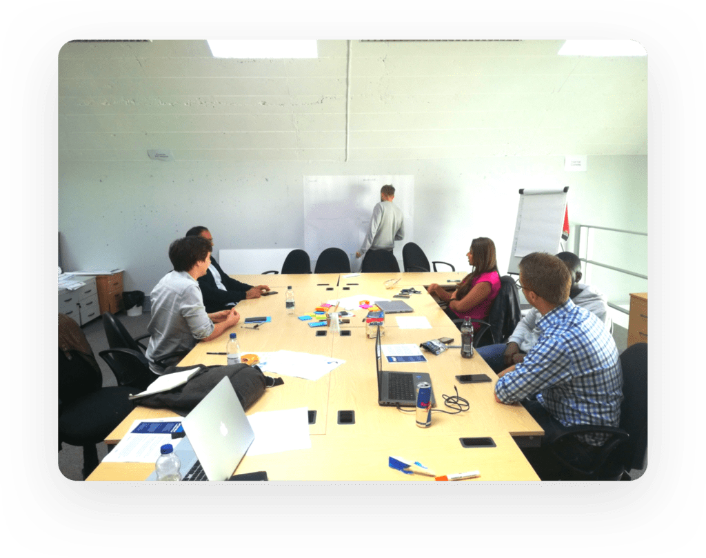
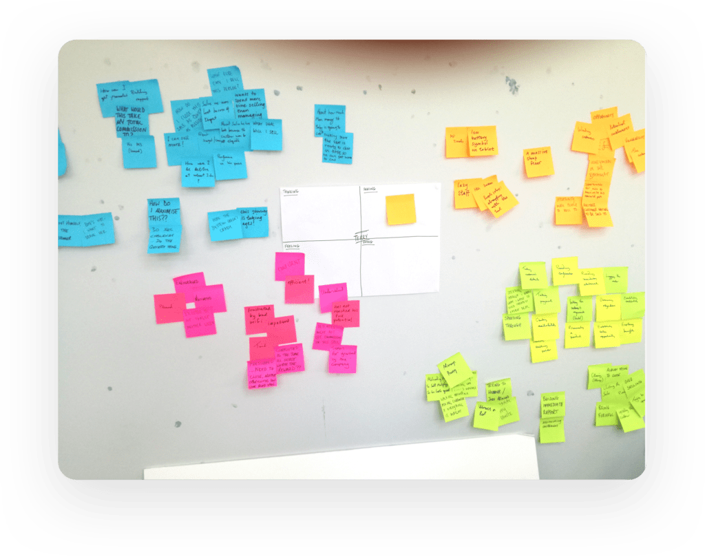
🖍 Design Thinking Workshop
Getting all the stakeholders in the same room for a 3-day workshop was a great way to empathize with the users and interpret our research findings.
During the sessions, we created Personas, Empathy Maps, User Journeys, Problem Statements and brainstormed on ideas for the solution.
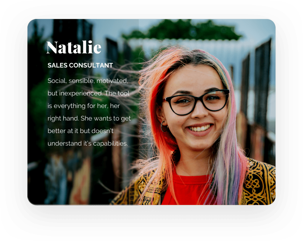
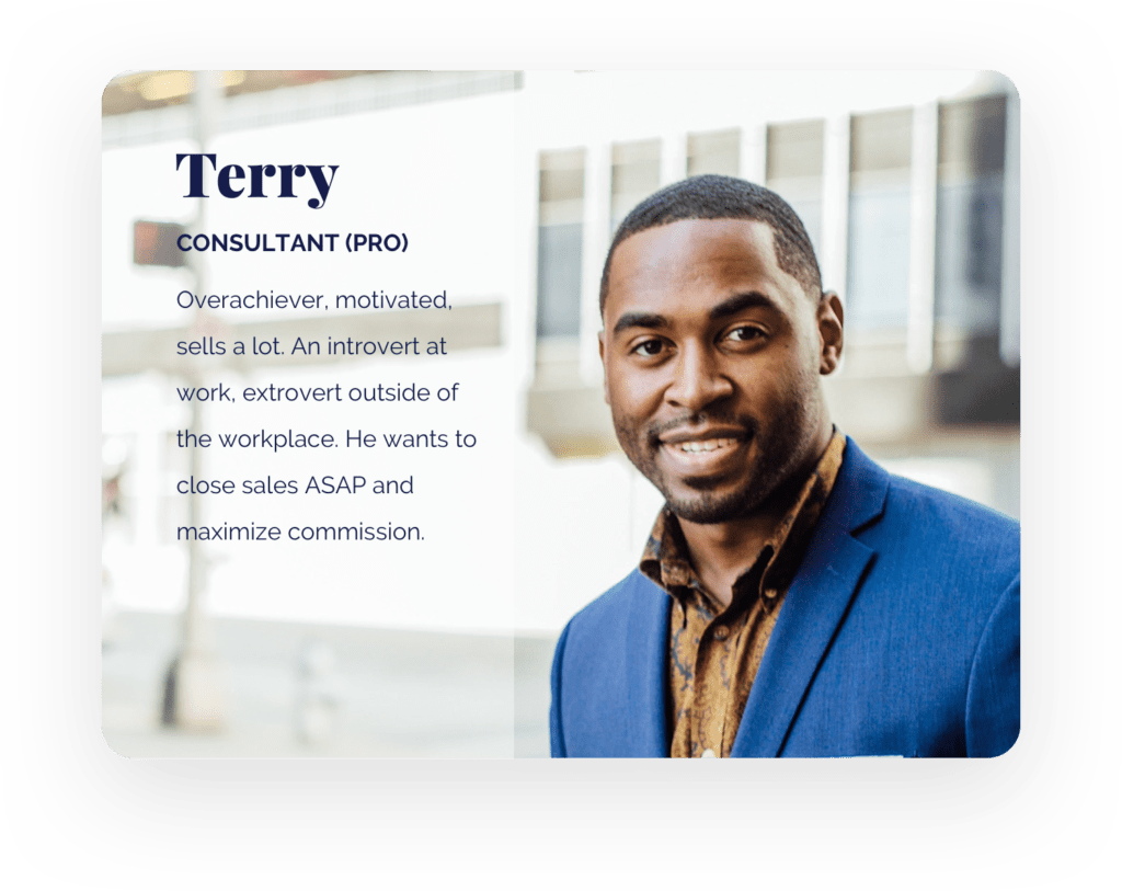
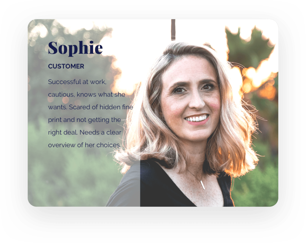
👤Personas
Forging an alignment on user behaviors, needs, and goals in a concise way, based on research data.
Group 38
Group 37
Group 37 Copy
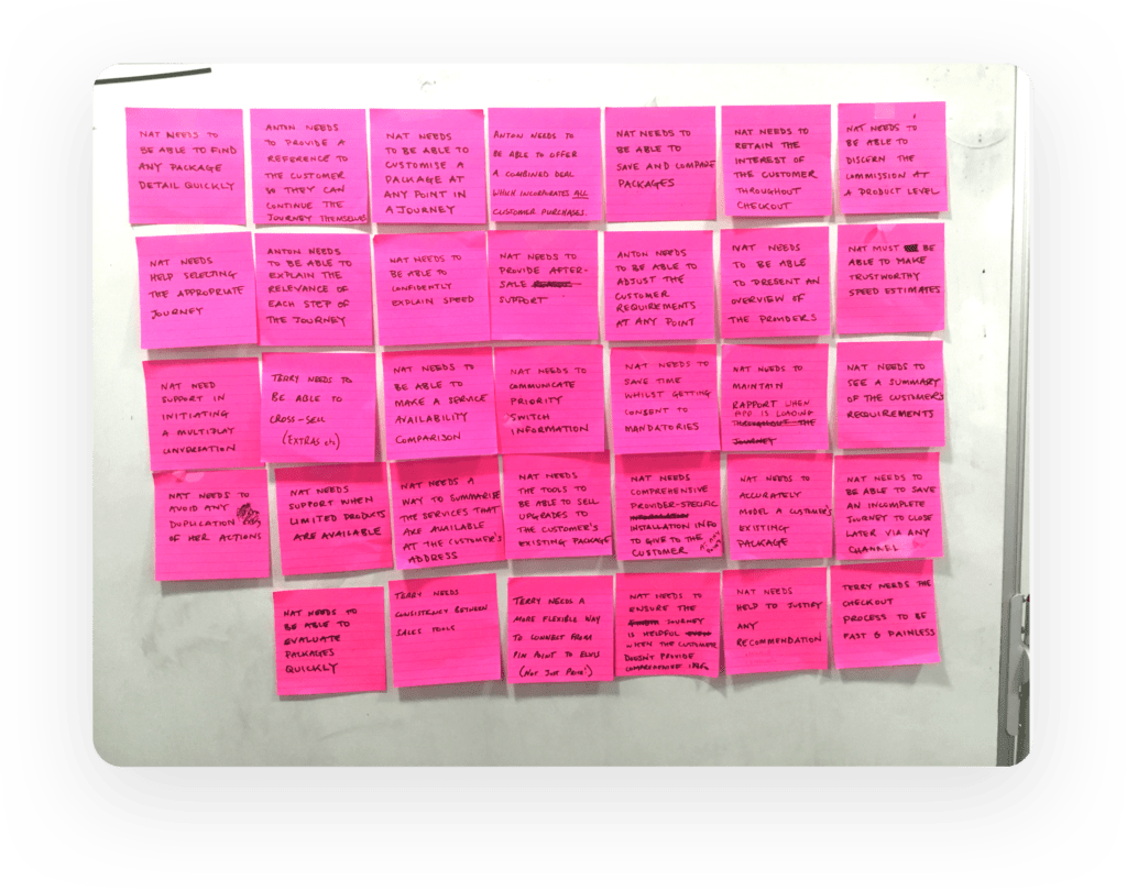
📌 Problem Statements
Reframing pain-points of the different users into statements. Ideating on solutions.
I. Educate and Support
Hand-holding the non-qualified colleagues through their journey with the customer.
II. Stimulate Efficiency
Reward and encourage high-achievers, resulting in maximum commission. Make it hassle-free to up-sell, cross-sell without losing time to navigate.
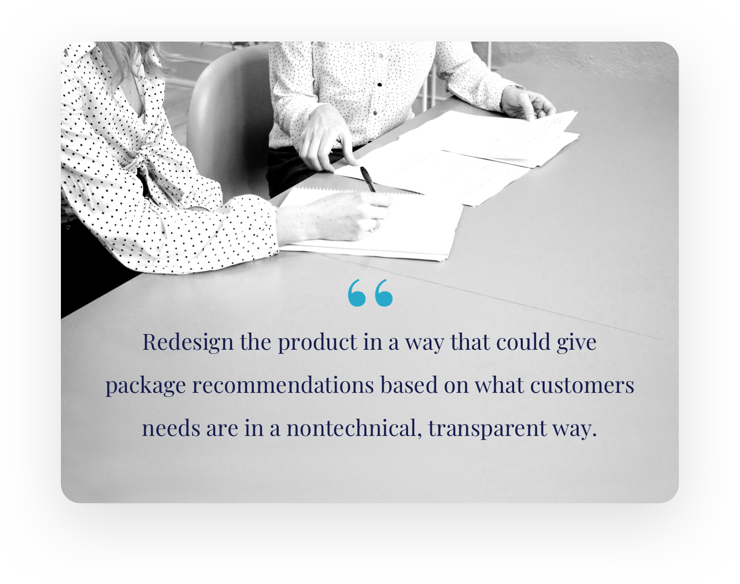
III. Recommendation Transparency
Making the process and results transparent for customers by clearly stating all the different pros and cons between deals.
Solve
Visualize the solutions in a way that they can be validated as well as refined early and often.
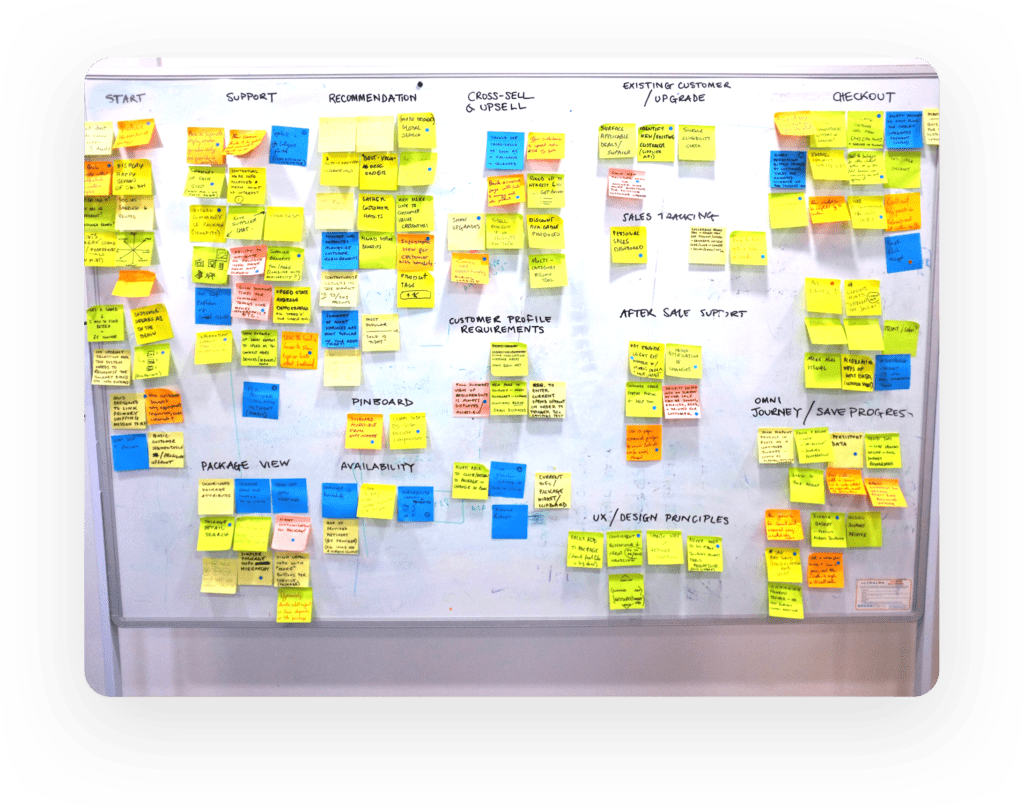
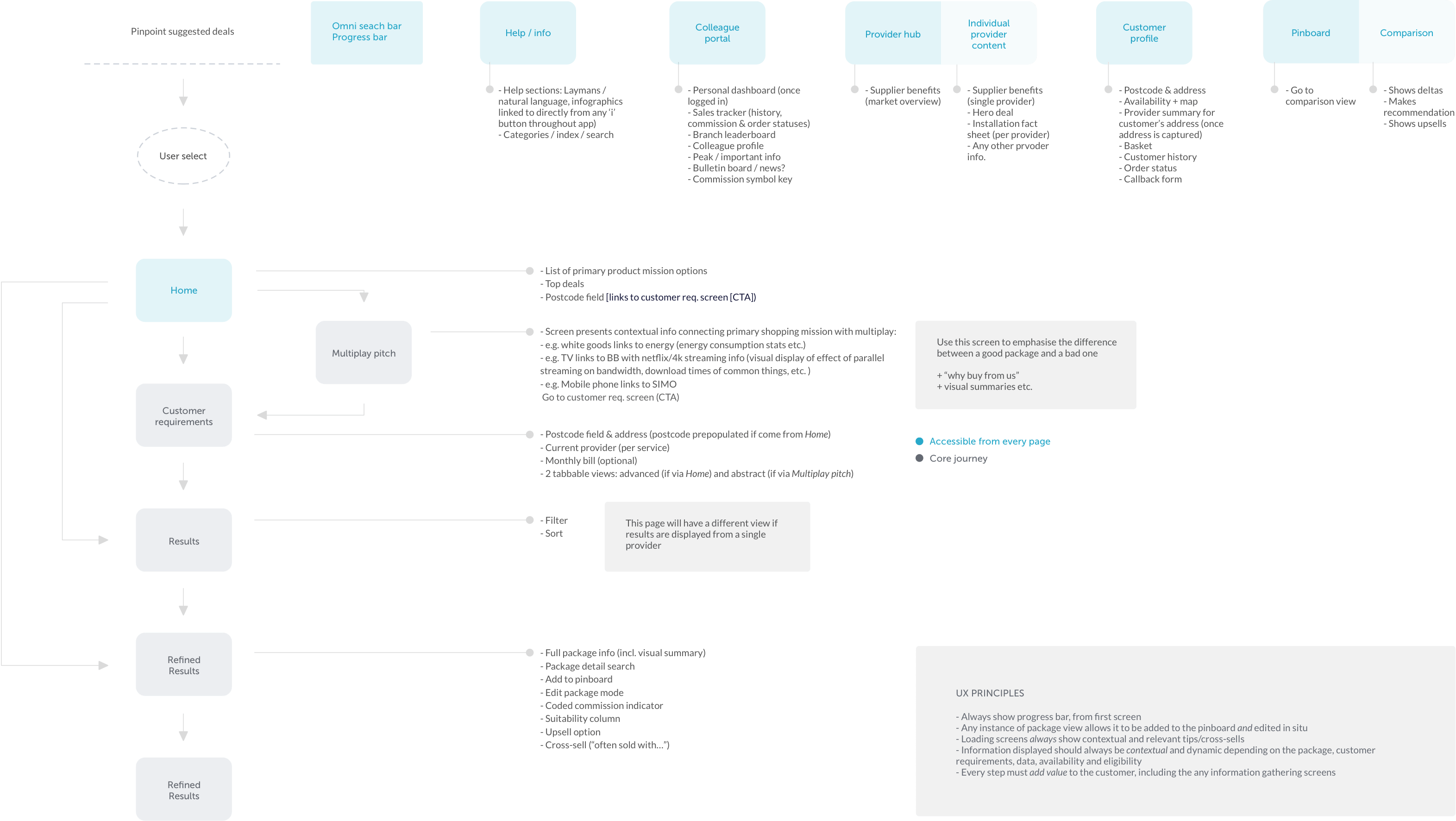
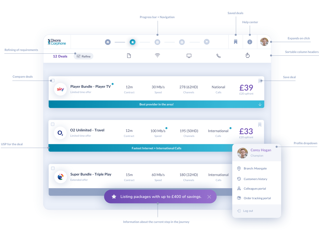
🗺 Information Architecture & Flows
Creating a mix of a sitemap and flows for the app, outlining key features.
✏ Wireframe & Prototype
Wireframing and evaluating the solutions. High-fidelity prototyping for micro-interactions.
I. Educate & Support
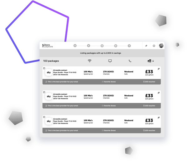
Deal Hints
After the customer adds his information a list of results is populated. We came up with a way to clarify why these are the best deals for him, which in return educates both the sales and the customer.
I. Educate & Support
Deal Hints
After the customer adds his information a list of results is populated. We came up with a way to clarify why these are the best deals for him, which in return educates both the sales and the customer.
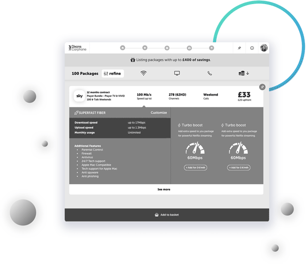
II. Stimulate Efficiency
Quick Cross-sell
The in-line cross-sell pop-up activates as soon as you add a deal, which gives the colleagues an option to build a better commission on the spot.
II. Stimulate Efficiency
Quick Cross-sell
The in-line cross-sell pop-up activates as soon as you add a deal, which gives the colleagues an option to build a better commission on the spot.
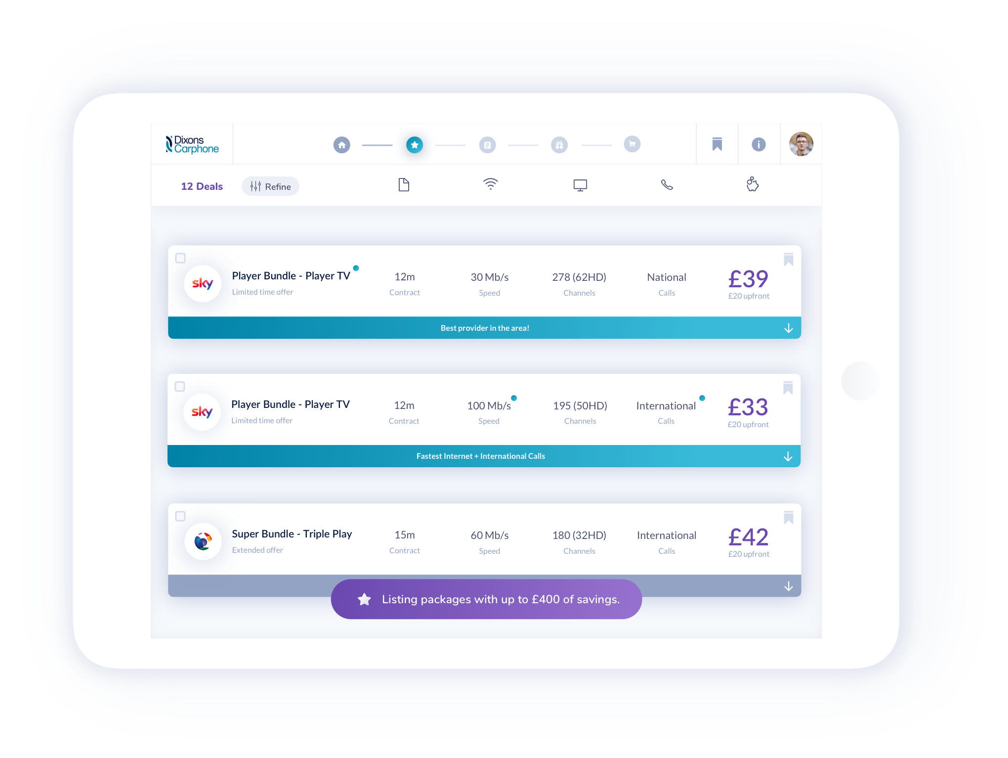
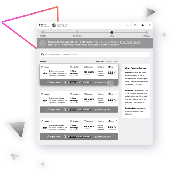
III. Recommendation Transparency
Simple Compare
It gives the customer a transparent overview of the deals and how they compare with each other. It’s easy to initiate and navigate directly from the results view.
III. Recommendation Transparency
Simple Compare
It gives the customer a transparent overview of the deals and how they compare with each other. It’s easy to initiate and navigate directly from the results view.
🖼 Visual Design + Features
My involvement in this project was focused on the discovery, but I also did a design concept to help set the future visual style.
✌️ Conclusion
Research was key for this project’s success and by applying different methods we managed to get a wide range of customer perspectives, which resulted in personalized features. Although the project was a success, we faced big challenges when trying to stripping down unnecessary information while focusing on high-potential solutions without sacrificing user needs.
🎖 Testimonial
“Miro was always exceptional when giving advice, communicating and a great overall designer. He always presented well composed and thought solutions to the problem at hand. He is an amazing designer capable of leading the design on a project from beginning to end.”

Pedro Ventura de Oliveira
Senior UX Designer @ Simplify Digital